Cannabis Delivery Case Study
Hi: The friendliest two-letter word in English. It starts every conversation and, for us, it’s the start of a great relationship with each of our customers. From the moment they see our brand to the first time they meet our friendly drivers, our customers are enjoying a casual conversation.
We’ve built a finacial model and product road map for the first year. Based off PS consumer habit and tourism $’s, delivery is the for front to cannabis growth in the Coachella Valley.
Further design and model is accessible with NDA
Creative Direction
Business Strategy
UI/UX Eddie Montenegro
Illustrations Richard Barakat

Color & Style


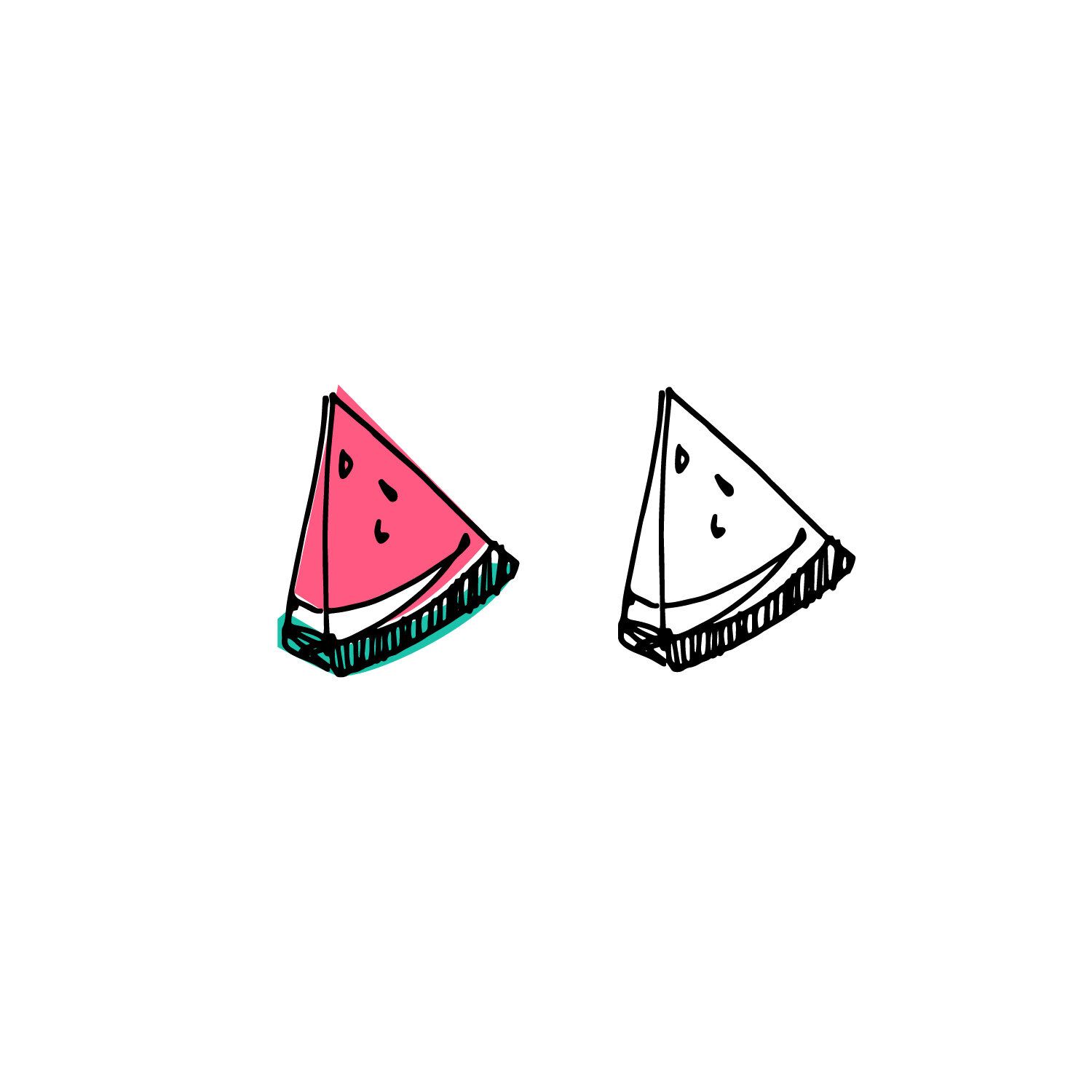
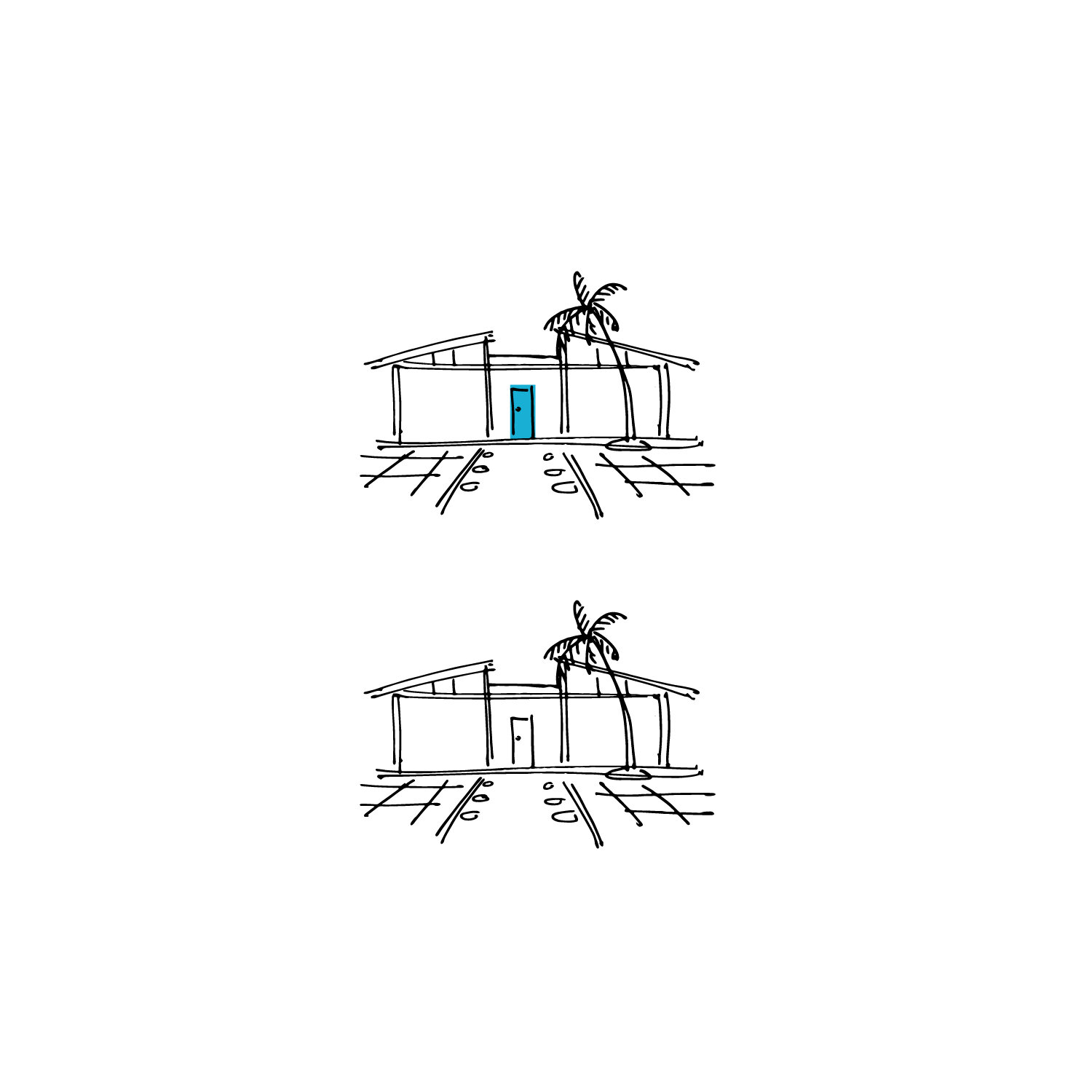
The illustrations are playful and vibrant just like PS. Hi positions itself as part of the PS landscape of escape, relaxation, and recovery.